
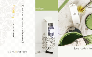
「スワロー」や「(旧)STORK」は、色を変えるくらいでそのまま使用しても十分オシャレで見やすいブログになります。ですが、オリジナル性も出していきたいですよね。
今回は、
- ページトップへ戻るボタン
- ページネーション
- (記事内)SNSボタン
- サイドバー
- 関連記事
のcssコードを公開します。
まず全体を通して、cssコードを貼り付ける場所は「テーマカスタマイズ」の「追加css」です。以下の手順で探して下さい。
管理画面の「外観」→「カスタマイズ」へ移動
次に一番下の項目にある「追加css」へ移動
コピーしたコードをそちらに貼り付け、保存
最新のSTORK──「STORK19」とも基本的に変わりませんが、異なるようでしたら各項目に追記してあります。

目次
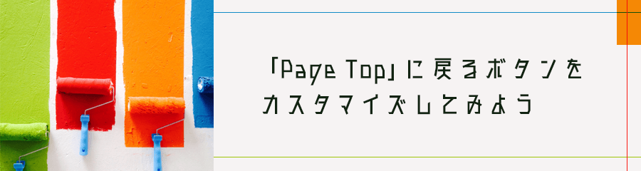
「ページトップへ戻る」ボタン
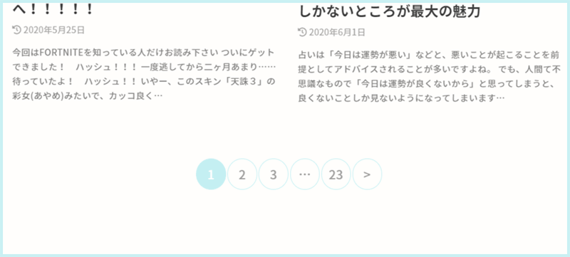
2023年1月の当サイトのページネーションはこんな感じです。
色だけ変えたい場合
/*パソコンの場合*/
#page-top a{
  background-repeat: no-repeat;
  text-decoration: none;
  width: 55px;
  height: 55px;
  border-radius: 50%;
  text-align: center;
  line-height: 55px;
  background: rgba(200, 244, 235, 0.8);
  padding: 0;
  display: block;
  color: #fff;
}

/*スマホの場合*/
@media only screen and (max-width: 767px){
  background-repeat: no-repeat;
  text-decoration: none;
  width: 42px;
  height: 42px;
  line-height: 41px;
  font-size: 0.85em;
}
以上です!
意外と簡単ですよね^^
色を変えたい時は、「background」の数値を変えてください。
また、画像を入れたい時は、「background」をコンテンツ全体の背景色と同じにし、画像urlを()で指定して下さい^^
※メディアにアップロードした画像のURLです
画像にしたい場合
/*パソコンの場合*/
#page-top a{
  background-repeat: no-repeat;
  text-decoration: none;
  width: 80px;
  height: 80px;
  border-radius: 0%;
  text-align: center;
  line-height: 80px;
  background: url(https://magokoroplus.com/wp-content/uploads/top01.png);
background-size: cover;
  padding: 0;
  display: block;
  color: rgba(255, 255, 255, 0);
}

/*スマホの場合*/
@media only screen and (max-width: 767px){
  background-repeat: no-repeat;
  text-decoration: none;
  width: 42px;
  height: 42px;
  line-height: 41px;
  font-size: 0.85em;
}
STORK19の場合
/* ページトップに戻るボタン */
#page-top {
  position: fixed;
  right: 10px;
  bottom: 0;
  z-index: 10000;
  transform: translateY(55px);
  transition: transform 0.2s ease-out;
}
#page-top.pt-active {
  transform: translateY(-10px);
}
#page-top .pt-button {
  background-repeat: no-repeat;
  text-decoration: none;
  width: 60px;
  height: 60px;
  border-radius: 0%;
  text-align: center;
  line-height: 55px;
  background: url(https://magokoroplus.com/wp-content/uploads/banana-girl-top.png);
background-size: cover;
  padding: 0;
  display: block;
  color: rgba(255, 255, 255, 0);
}
}
#page-top .pt-button::before {
  font-family: var(--stk-font-awesome-free, "Font Awesome 5 Free");
  content: "\f077";
  font-weight: 900;
}
以上でページトップへ戻るボタンのカスタマイズは終わりです。
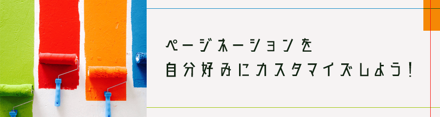
ページネーションのカスタマイズ
記事一覧などの下の方に、番号が振ってありますよね?
2つ目以降の記事(一覧)に進むための番号で、これを「ページネーション」といいます。
これがですね、気になって仕方なかったんですw
丸くてもっとパステルカラーにしたかった。
記事内のページネーションも本当は変えたかったのですが、どうしてもそのコードがどこにあるのかわからず、記事内に関しては「改ページ」は使わずに一つずつにして、「前のページ」「次のページ」とリンクを貼ることにしました。
スワローの場合
/* ページネーション */
.pagination a, .pagination span,
.page-links a{
	margin: 0;
	display: block;
	padding: 12px 6px;
	text-decoration: none;
	line-height: 1;
	font-size: 1em;
	width: 100%;
	border-radius: 50%;
	color: #a0a0a0;
	border: 1px solid #c4eff2!important;
 font-weight: normal;
}
.page-links a{
	display: inline-block;
	width: 47%;
}
.pagination span.dots{
	background: none!important;
	padding-left: 5px;
	padding-right: 5px;
}
.pagination a:hover, .pagination a:focus, .pagination span:hover, .pagination span:focus,
.page-links a:hover, .page-links a:focus{
	border: rgba(200, 244, 235, 0.8)!important;
	background-color: rgba(200, 244, 235, 0.8)!important;
	color: #a0a0a0;
}
.pagination .current{
	cursor: default;
	color: #fff;
	background-color: #c4eff2!important;
}
.pagination .current:focus,
.pagination .dots:hover, .pagination .dots:focus {
	color: #111;
}
ストークの場合
/* ページネーション */
.pagination a,
.pagination span,
.page-links a,
.page-links ul > li > span {
	margin: 0;
	padding: 10px 17px;
	text-decoration: none;
	border-radius: 50%;
	line-height: 1;
	font-size: 1em;
	font-weight: normal;
	color: #909090;
	border: 1px solid #c4eff2!important;
}
.pagination span.dots,
.page-links ul > li > span.dots {
	background: none!important;
	padding-left: 12px;
	padding-right: 12px;
}
.pagination a:hover,
.pagination a:focus,
.pagination span:hover,
.pagination span:focus,
.page-links a:hover,
.page-links a:focus {
	border: rgba(200, 244, 235, 0.8)!important;
	background-color: rgba(200, 244, 235, 0.8)!important;
	color: #fff;
}
.pagination .current,
.page-links ul > li > span {
	cursor: default;
	color: #fff;
	background-color: #c4eff2!important;
}
.pagination .current:focus,
.pagination .dots:hover,
.pagination .dots:focus {
	color: #111;
}
以上でページネーションは終了です!
カラーはメインカラー(全体の70%に使う色)やその同系色(全体の25%に使う色)にすると、よりキレイに見えます^^
記事内SNSのボタン
こちらは「スワロー」のみのカスタマイズとなります。
記事内のSNSボタン、結構存在感が強いです。ですが、「SNSボタンを非表示」とすると投稿内のSNSが全て表示されなくなります。

彩度が高く、大きさもしっかりとしているので、色だけでも変えたい!と思ってました。
で、色々と試してみたところ……
こんな感じに出来上がりました!!
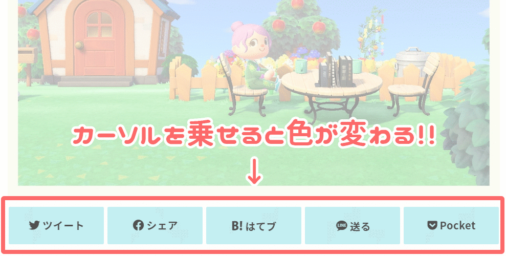
こちらのSNSボタンをサイトのメインカラーに合わせるだけでもかなり統一感がうまれ、オシャレ度が上がります。シンプルでキレイ。
SNSボタンのcss【スワロー】
/* Twitter */
.sns .twitter a {
  background: #c4eff2;
  box-shadow: 0 0 0 #c4eff2;
  color:#505050;
}
.sns .twitter a:hover {
  background: #eaf9f1;
  color: #909090;
}
.sns .twitter a::before{
  content: "\f099";
}

/* Facebook */
.sns .facebook a {
  background: #c4eff2;
  box-shadow: 0 0 0 #c4eff2;
  color:#505050;
}
.sns .facebook a:hover {
  background: #eaf9f1;
  color: #909090;
}
.sns .facebook a::before{
  content: "\f09a";
}

/* hatebu */
.sns  .hatebu a {
  background: #c4eff2;
  box-shadow: 0 0 0 #c4eff2;
  color:#505050;
}
.sns .hatebu a:hover {
  background: #eaf9f1;
  color: #909090;
}
.sns li.hatebu a::before{
  content: "\e903";
}

/* LINE */
.sns .line a {
  background: #c4eff2;
  box-shadow: 0 0 0 #c4eff2;
  color:#505050;
}
.sns .line a:hover {
  background: #eaf9f1;
  color: #909090;
}
.sns li.line a::before{
  content: "\e904";
}

/* Pocket */
.sns .pocket a {
  background: #c4eff2;
  box-shadow: 0 0 0 #c4eff2;
  color: #505050;
}
.sns .pocket a:hover {
  background: #eaf9f1;
  color: #909090;
}
.sns .pocket a::before{
  content: "\f265";
}
以上で終了です!
色はお好みに合わせて変えて下さい。
サイドバーをカスタマイズ
サイドバー(ウィジェット)タイトルデザインと、カテゴリーやタグの文字前にアイコンをつけてみます。
スワローの場合
/* サイドバータイトル */
.widgettitle {
    background: #fffefc;
    border-bottom: 3px solid #c4eff2;
    color: #565656;
    font-size: 1em;
    padding: .65em .8em;
    margin-top: 0;
    margin-bottom: .75em;
    overflow: hidden;
}


/* サイドバーカテゴリー */
.widget.widget_categories li a::before{
    font-family: "fontawesome";
    content: '\f07b';
    margin-right: 3px;
}
.widget.widget_categories li ul a::before{
    font-family: "fontawesome";
    content: '\f15c';
    color: #888;
    margin-left: 4px;
}
.widget.widget_categories li ul ul a::before{
    font-family: "fontawesome";
    content: '\f101';
    color: #a0a0a0;
}
ストークの場合
/* サイドバータイトル */
.widgettitle {
    background: #fffefc;
    border-bottom: 3px solid #c4eff2;
    color: #565656;
    font-size: 1em;
    padding: .65em .8em;
    margin-top: 0;
    margin-bottom: .75em;
    overflow: hidden;
}

/* サイドバーカテゴリー */
.widget.widget_categories li a::before{
    font-family: "fontawesome";
    content: '\f07b';
    margin-right: 3px;
}
.widget.widget_categories li ul a::before{
   font-family: "fontawesome";
   content: '\f15c';
   color: #888;
}
.widget.widget_categories li ul ul a::before{
   font-family: "fontawesome";
   content: '\f101';
   color: #a0a0a0;
}

/* サイドバータグ */
.widget.widget_tag_cloud a.tag-cloud-link{
    padding: 0.1em 0.6em;
    margin: 0 0.2em 0.3em 0;
    display:inline-block;
    font-size: 13px!important;
    background: #fefdfb;
    border-radius: 3px;
    color: #3f3f3f;
    box-shadow: 0 0 1px;
    opacity:0.8;
}
.widget.widget_tag_cloud  a.tag-cloud-link::before{
    font-family: "fontawesome";
    content: '\f02b';
    margin-right: 3px;
}
.widget.widget_tag_cloud  a.tag-cloud-link:hover{
    filter: alpha(opacity=60);
    -ms-filter: "alpha(opacity=60)";
    opacity: 0.4;
    color: #383838;
}
以上でサイドバーのカスタマイズは終了です!
関連記事をシンプルだけどオシャレに

関連記事のタイトルを「あわせて読みたい」という文字にしたかったので、カスタマイズしてみました。

スワロー・ストークの場合
/* ショートコードで関連記事を取得 */
.related_article{
	margin: 1.8em auto;
	text-align: left;
	max-width: 800px;
}
.related_article p.ttl{
	margin: 0 0 0.1em;
	font-size:1em;
	font-weight: bold;
}
.related_article .ttl::before{
	content:'あわせて読みたい';
	font-size:.6em;
	font-weight:bold;
	color:#565656;
	background:#fff;
	border: solid 1px #999;
	width: 10em;
	display:inline-block;
	padding: 0.1em 0.4em;
	position:relative;
	top:-2px;
	text-align:center;
	margin-right:0.5em;
	-webkit-border-radius:2px;
	border-radius:2px;
}
.related_article.labelnone .ttl::before{
	content:none;
}
.related_article .date{
	font-size:0.8em;
}
.related_article .thum{
	width: 22%;
	padding-right: 0.7em;
}
.related_article .thum img{
	width:100%;
	margin-bottom: 0;
}
STORK19の場合
ちなみにSTORK19では、以下のcssコードで変えられます。
/* ショートコードで関連記事を取得 */
.related_article .labeltext{
  font-size: 70%;
  font-weight: bold;
  border: solid 1px #888;
  background-color: #fff;
  color: #555;
  display: inline-block;
  padding: 0.1em 0.5em;
  position: relative;
  top: -2px;
  text-align: center;
  margin-right: 0.5em;
  border-radius: 2px;
}「関連記事」の文字については、ショートコードで指定してください。
記事ナンバーは投稿画面のURL欄にある数字です。
▼記述方法
[kanren postid="記事ナンバー" labeltext="あわせて読みたい"]すると、このように表示されます^^
「関連記事」の部分が無事「あわせて読みたい」に変わりました!!
最後に
- ページトップへ戻るボタン
- ページネーション
- (記事内)SNSボタン
- サイドバー
- 関連記事
今回はこの5つのデザインをカスタマイズしてみました。
ご自分のサイトに合わせてカスタマイズを楽しんで下さい。
ご参考までに!


